Brand Identity Design for Signature Travel
I recently wrapped up a Branding Only Project with Nicole of Signature Travel. It was an awesome project to work on and I absolutely loved working with her. She was a pleasure to work with and took guidance very well breezing through each stage of the design process.
When Nicole initially came to me, like everyone else she came looking for logo design and a few marketing items in a rush for a an expo. Thankfully she decided to heed words to the wise and simply go to the expo to observe her competition. Anyone who knows the marketing world, it’s best not to throw something together in a rush because you end up not developing your marketing material and would have wasted money because your branding cannot be done overnight.
It’s a process.
And so its better to do something right the first time, rather than having to waste not just money but time to do it over again.
So she decided to wait and booked her project, made her deposit and was booked into the next available time slot.
Stage 1 Brand Discovery & Strategy
We start with a brand coaching session. My brand package started including brand strategy because simply put we live and learn. Branding does not come from the visuals first it comes from being clear on who you are as a brand and what you to communicate. From past horrible clients, I learned that many just aren’t ready yet and by doing strategy it allows me to help them figure these basics out such as your ideal client, your brand story, your who, why, what and more. We dig deep to truly uncover your brand essence before any designing can begin.
Stage 2 Inspiration Board
(Digital Clippings via Pinterest)
When Nicole was first given her client homework assignment which would be to pin items that resonate with her for her brand, I was a bit surprised when I saw there was hardly anything when she said it was completed and the items did not seem to be connected. So emergency session had to happen as she told me via text that she was not sure what to do. Ok so scheduled an additional call and I walked her through the process of what she had to do and how to pin, what to search for etc. By the end of our Pinterest session she was clear on how to move forward, which made me happy. I am always happy when clients gain clarity, more on this later as it comes up again…
Stage 3 Mood Board
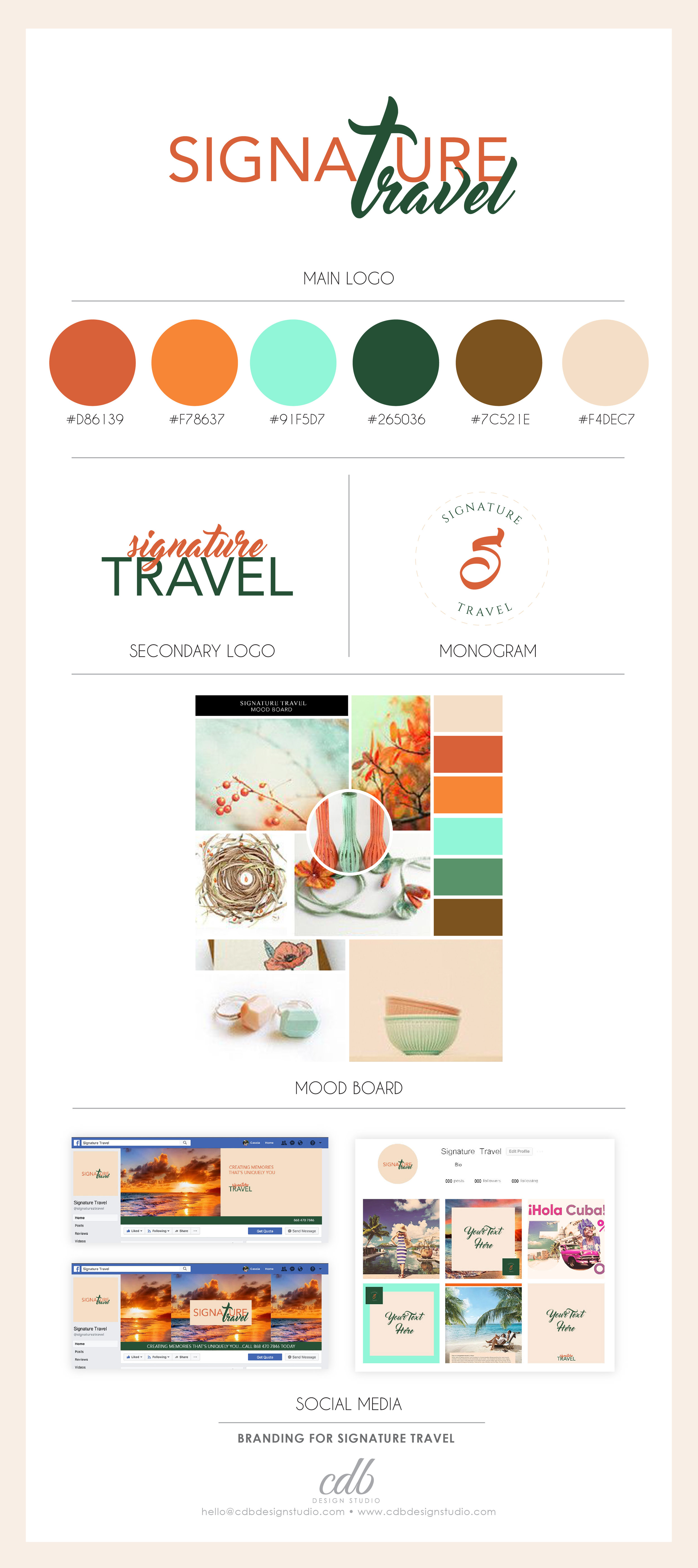
When she did take 2 of her Inspiration Board, things were much more clear and I was able to pull together a mood board that was exactly what she wanted. She was very drawn to orange, which had that grown woman aesthetic she was going for. After giving her a Branding Challenge that forced her to answer some tough questions on her Brand Story she gained even more clarity, the clarity she was searching for. Her answers allowed me to see who her ideal client was so specifically that and made me so happy to see that what I was creating visually was in alignment with who she was speaking to and their pain points.
Stage 4 Logo Design
From her mood board this is where the colour palette was developed and I created two logo options that were clean, sophisticated and timeless. An iconic logo should stand the test of time, its not about something that is pretty and trendy for what’s in the market at the time. Then you run the risk of having a logo that outdated faster than you can imagine.
From Nicole's Inspiration Board, she was drawn to feminine script fonts and a particular style of font, yet of course being the Brand Queen that I had to incorporate what she was drawn too and also be sure she conveys the right message for her industry, finding the right balance of both is important.
And so these were the first options...
At the moment, I can't exactly remember the feedback for option 1. Option 2 she loved but there were reservations about about the font for the word "Signature", she wanted a more san serif font and so we arrived at the option below and moved to create the logo variations for the chosen design.
Nicole was happy and ready to move on the next step. Her logo is simple, clean, effective, classy, timeless, easy to read and scale on various mediums.
The colour palette and choice of colours are mature and sophisticated, just who it needs to represent. As her ideal client are women, who are mothers, here is her an excerpt of the description of her ideal client.
"A 38 year old mother of a 2 year old and married for 3 years works full-time and is sometimes assisted in critical times by her 53 mother with some health issues, her husband works and does not comprehend the burden of all her roles as supervisor, business owner, mother and wife so the support is not what is required."
Nicole is speaking to women who need to indulge in some self care due to life's demands. They need to get away and need the burden of planning travel taken off their hands and have access to affordable packages. This is where Signature Travel comes into play.
Stage 5 Collateral Pieces
The next step would be to create her collateral pieces/ marketing pieces used for promotional purposes. Nicole was different and I loved it. She decided to opt out of the traditional choice of a business card, (that's my girl).
She understood that most times business cards are thrown away and she knows she will barely have use for it on a day to day basis and will do these on a need be basis, doe example when she needs to attend a trade show again or networking event.
She decided to to choose Social Media Branding, and so we eagerly went ahead to create these for her.
And this was the result that was approved with no further changes!
What do you think of Nicole's new branding? What are your favorite aspects of this project, would you have chosen logo option 1? Tell us in the comments below?









![Key Takeaways from Google Job Shadowing Pauleanna Reid [PODCAST]](https://images.squarespace-cdn.com/content/v1/588d1b69d1758e87f05c0c04/1631066453877-IWDOWIHV7SJJQJI4SC1T/3.png)
![Two (2) Simple Marketing Strategies To Be Booked Out For The Year ft. Stephanie Rubio [PODCAST]](https://images.squarespace-cdn.com/content/v1/588d1b69d1758e87f05c0c04/1626659271444-X6L5I60AJJRKEHOSPKMR/3.png)